Dashboard
The dashboard is the landing page you see after logging in. It gives you a high-level view of your observability pipeline health across the selected environment, with real-time metrics, fleet status, and interactive charts.
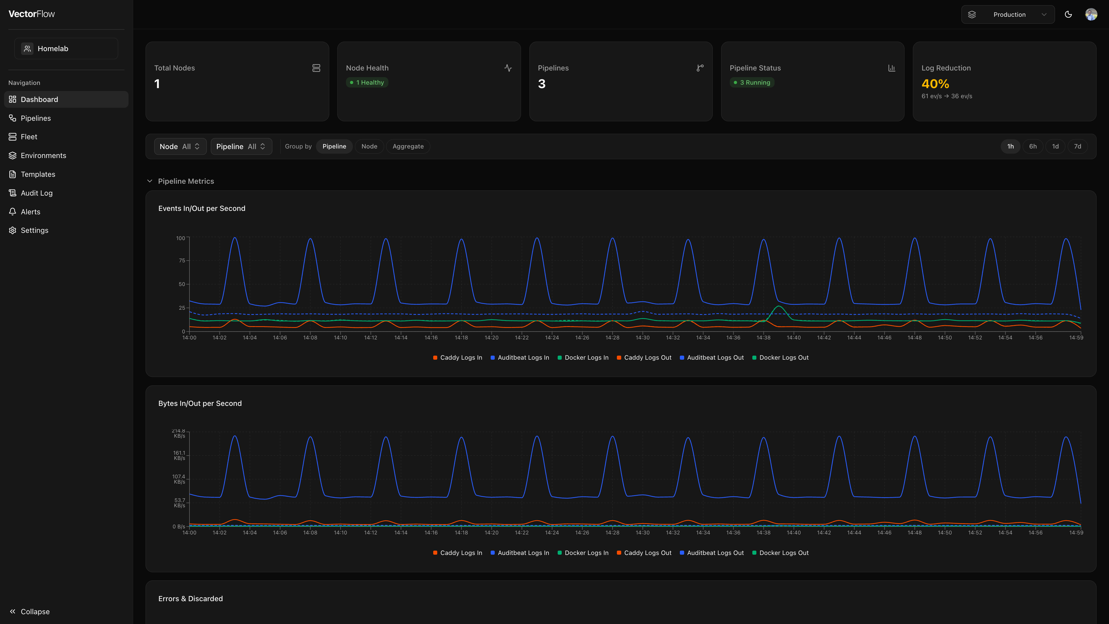
KPI summary cards
The top of the dashboard displays five summary cards that provide an at-a-glance overview of your environment.
| Card | What it shows |
|---|---|
| Total Nodes | The number of Vector agent nodes registered in the current environment. |
| Node Health | A breakdown of node statuses -- Healthy, Degraded, or Unreachable -- so you can spot issues quickly. |
| Pipelines | The total number of deployed (non-draft) pipelines in the environment. |
| Pipeline Status | Counts of pipelines by runtime state: Running, Stopped, or Crashed. |
| Log Reduction | The percentage of data volume reduced by your transforms (see below). |
Log reduction percentage
The Log Reduction card shows how effectively your pipelines are filtering and transforming data before it reaches your sinks. The formula is:
reduction % = (1 - eventsOut / eventsIn) * 100- A higher percentage means more data is being filtered, sampled, or deduplicated by your transforms before reaching downstream destinations.
- The value is clamped to 0% minimum -- if your pipeline produces more events than it receives (e.g. through event splitting), the card shows 0% rather than a negative number.
- The card also displays the raw events-per-second rates for both input and output so you can see absolute throughput.
- Color coding provides quick visual feedback: green for reductions above 50%, amber for 10--50%, and neutral for lower values.
Reduction metrics are calculated from the last hour of aggregated pipeline data. If no traffic has flowed recently the card will display a dash.
Metrics filter bar
Below the summary cards, a filter bar lets you narrow down the charts displayed on the dashboard.
- Time range -- Choose from 1 hour, 6 hours, 1 day, or 7 days. The selected window controls both the data shown in the charts and the automatic refresh interval.
- Pipeline filter -- Select one or more pipelines to focus on. When no pipelines are selected, all deployed pipelines in the environment are shown.
- Node filter -- Select specific agent nodes. Filtering by node automatically restricts the pipeline list to pipelines running on those nodes, and vice versa.
- Group by -- Choose how chart series are broken down:
- Pipeline -- one series per pipeline (default)
- Node -- one series per agent node
- Aggregate -- a single "Total" series combining all pipelines and nodes
Pipeline metrics charts
The Pipeline Metrics section includes three charts:
- Events In/Out per Second -- Shows the rate of events entering your sources and leaving your sinks. Comparing the two lines reveals how much data your transforms are reducing.
- Bytes In/Out per Second -- The same comparison in bytes, useful for understanding bandwidth and storage impact.
- Errors & Discarded -- An area chart showing error rates and discarded event rates. A spike here may indicate a misconfigured transform or an unreachable sink.
System metrics charts
The System Metrics section shows resource utilization for the agent nodes in your environment:
- CPU Usage -- Percentage of CPU consumed by each Vector agent. Capped at 100%.
- Memory Usage -- Percentage of available memory used by each agent.
- Disk I/O -- Read and write throughput in bytes per second.
- Network I/O -- Receive (Rx) and transmit (Tx) throughput in bytes per second.
When Group by is set to Aggregate, CPU and memory are averaged across nodes while disk and network rates are summed.
System metrics require the VectorFlow agent to be reporting node-level telemetry. If a node is unreachable, its metrics will stop updating until connectivity is restored.
Auto-refresh
Dashboard data refreshes automatically based on the selected time range:
| Time range | Refresh interval |
|---|---|
| 1 hour | 15 seconds |
| 6 hours | 60 seconds |
| 1 day | 60 seconds |
| 7 days | 5 minutes |
Pipeline status cards also poll every 15 seconds regardless of the selected time range, so you will see status changes (Running, Stopped, Crashed) promptly.
Analytics
The Analytics page (accessible from the sidebar) provides a deeper breakdown of pipeline volume metrics compared to the dashboard summary.
KPI cards
The analytics page displays four KPI cards with trend indicators comparing the current period to the previous period:
| Card | What it shows |
|---|---|
| Bytes In | Total bytes ingested by all pipeline sources. |
| Bytes Out | Total bytes emitted by all pipeline sinks. |
| Events Reduced | Percentage of events reduced by transforms, calculated as (1 - eventsOut / eventsIn) × 100, clamped at 0%. |
| Bytes Saved | Percentage of bytes saved through pipeline processing, calculated as (1 - bytesOut / bytesIn) × 100. Hover for a tooltip showing the absolute bytes saved. |
Each card shows a trend arrow indicating whether the metric increased or decreased compared to the previous period. For reduction metrics, an upward trend (more reduction) is shown in green.
Per-pipeline table
Below the KPI cards, a sortable table shows per-pipeline volume breakdown:
| Column | Description |
|---|---|
| Pipeline | Pipeline name |
| Bytes In / Out | Total bytes ingested and emitted, formatted as human-readable sizes |
| Events Reduced | Percentage of events reduced, shown with a color-coded progress bar (green > 50%, amber > 20%, red below) |
| Bytes Saved | Percentage of bytes saved, shown with a color-coded progress bar |
Click any column header to sort the table. The time range filter at the top controls the aggregation window.
Custom dashboard views
You can create personalized dashboard views that display only the panels you care about. Custom views are saved per-user and persist across sessions.
Creating a view
Open the view builder
Click the + New View button in the tab bar at the top of the dashboard.
Name your view
Enter a short, descriptive name (up to 50 characters).
Select panels
Check the panels you want to include. Panels are grouped into three categories:
| Category | Available panels |
|---|---|
| Pipeline | Events In/Out, Bytes In/Out, Error Rate, Data Reduction % |
| System | CPU Usage, Memory Usage, Disk I/O, Network I/O |
| Summary | Node Health Summary, Pipeline Health Summary |
Save
Click Create. Your new view will appear as a tab in the tab bar.
Arranging panels
Custom view panels support drag-and-drop reordering and resizing.
- Click the Editing Layout button (lock icon) in the top-right corner of the view to unlock the layout.
- Drag any panel by its header to reposition it within the grid.
- Resize a panel by dragging its bottom-right corner handle.
- Click Layout Locked to lock the layout and prevent accidental changes.
Layout changes are saved automatically. Each user's layout is independent — rearranging panels does not affect other users.
Switching views
The tab bar at the top of the dashboard shows all your custom views alongside the Default view. Click any tab to switch to that view. Each custom view has its own time range picker and filter bar for any chart panels it includes.
Editing and deleting views
Hover over a custom view tab to reveal the edit and delete icons. Click the pencil icon to update the view name or panel selection, or click the trash icon to remove the view.
Custom views are scoped to your user account. Other team members will not see your custom views, and you will not see theirs.